How to design a great photo book
Creating a photo book is a totally personal experience, and every photo book we print at Momento is unique. After printing thousands of books, chatting to book designers, and researching photo book design theory, we've compiled our top tips on photo book design. These are a guide only, so don't let them curb your creativity. We hope you have fun with your design.
To make a cracking photo book design:
- Be clear on the purpose of your book
- Keep the layout simple so the photos shine
- Include only your best and most meaningful photographs
- Feature hero shots on a page of their own or across a spread for impact
- Symmetry, white space and consistent margins will make your design look stylish and professional
- Choose the paper, cover, and finishes that best suit the purpose of your book and the page designs
Purpose and plan
What story are you trying to tell? Start by defining your book's purpose then let it guide all your decisions.
A portfolio is all about presenting your best photographs for maximum impact. It will include your most technically excellent images, maybe one image to a page, and text about the subjects, locations or camera settings. A larger size photo book presented in a clamshell box will make it look more distinguished, and keep it safe for handing on to the next generation.
A book of holiday photos is a different beast. It's more playful, because you're telling a story about places you visited, people you saw and the culture you experienced, as well as what you did with family and friends. If you add text it may be more poetic, and unlike a portfolio, variety in layout is important as you can't just repeat the same design again and again, you want to keep the reader turning the pages.
Sort and select
To make the process easier, separate the task of choosing photos from that of laying them out. As we said, 'less is more,' so only select your best shots that support the story. Don't include duplicates, photos that are poorly composed, or out of focus. If you have a dud that has special meaning, include it in a grid or use it as background image and lower the opacity.
For a travel album, choose a variety of photos that tell the full story - people, objects, landscapes and textures. If it's a family portrait book with photos from a professional shoot that are quite similar, create variety by selecting photographs shot from different angles and perspectives.
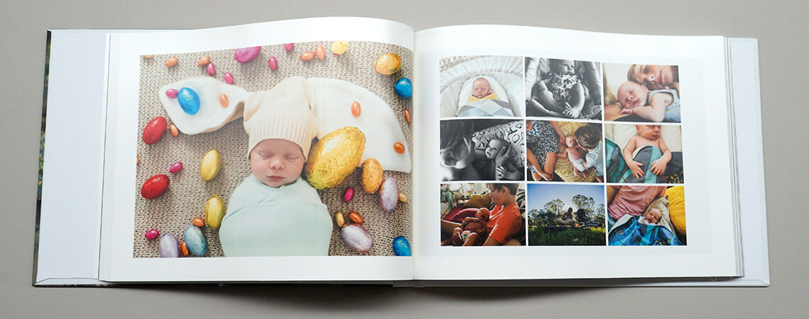
It's also handy to sort photos into different folders. One for 'hero' shots that are worthy of their own page, and another for secondary images that can appear smaller in size, and act as visual punctuation, connecting the pages and keeping a good flow.
There's no perfect number of photos to include in a photo book but once again we think, 'less is more.' Fewer but better photos makes your photography look excellent and your book look more professional.
Sequencing
There's no right or wrong way to sequence your photos, it's up to you! It makes sense to use chronological order in a travel album whereas a family history book can be sorted by sibling, place or era, and a 'best of' collection, can be grouped by theme, colour or texture. Place photos together that relate to or enhance each other, choosing what's most appropriate for your book's purpose.
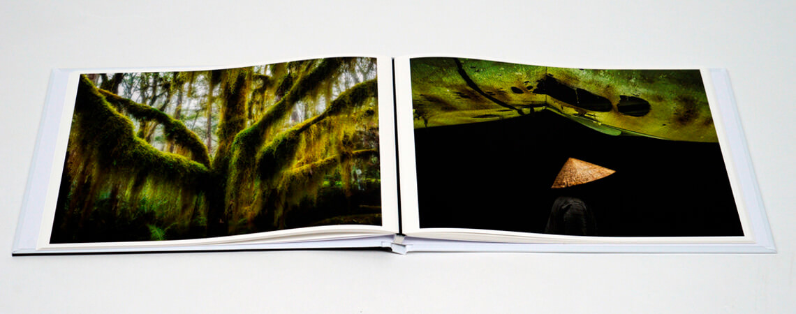
Have fun when pairing your photos too. Some have more impact and meaning when sitting beside others, than when they appear on their own. Photographer Ralph Gibson believed that, "by placing a picture on the right page and a picture on the left, something must transpire in between the two page spread, and the sum must equal more than the total of its parts." So try pairing by colour, shape or theme, then play with different combinations until you're happy.
Size and symmetry
The photographs must be the star of the book design. They shouldn't be overwhelmed by too many frames, backgrounds, fonts or other decorative distractions. If you do add more elements to a page, make sure they enhance the photos and your story.
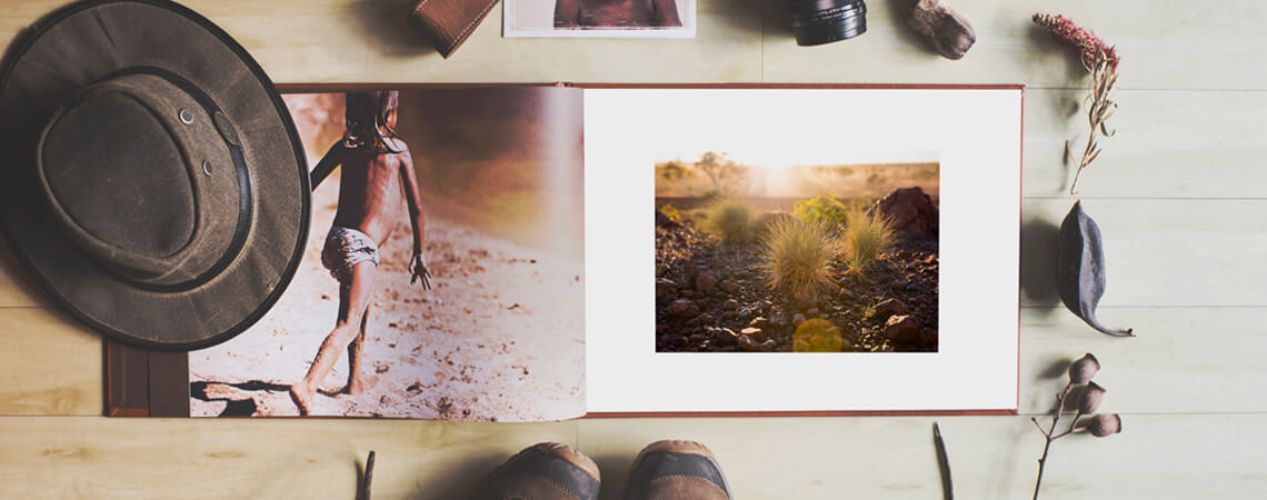
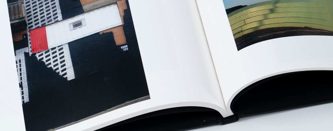
Elevate your hero shots. These are photos that are strong enough to stand on their own. They should appear at the largest size, filling most or all of a single or double page. If they're panoramas, do them justice by spanning them across two pages then choose Lay-flat paper, so they sit perfectly flat when printed.
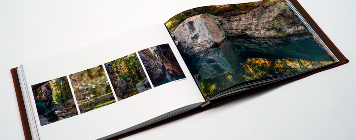
If you want to place lots of photos on a page, use the software's alignment tools and templates to maintain visual harmony. If you have a series of photos shot in quick sequence, lay them out symmetrically across or down the page, like a film reel. For six or more photos on a page, choose a number that allows you to use a grid design to keep things balanced and clean.
White space
We've explained how to deal with different graphic elements on a page but the white space in your book is just as important. Leaving space around or beside a photo allows your photos to shine, while adding a blank page gives the viewer a moment to reflect upon your book.
The same applies to leaving space around and between text. If you create a book that includes a lot of text don't make the text run all the way from the left to right edges, give it (and the reader) room to breath with white space (wider margins). Two columns can also make it easier to read especially if your book is landscape orientatinon.
To help maintain consistent margins across all the pages of your book, don't forget to use the Guides and Rulers in the Momento software. Consistent alignment will give your book a truly professional look.
Text and type
If you do add text, choose a font style and size that's appropriate to your book's purpose and audience. Serif fonts are easiest to read if you include lots of text, and an older audience will appreciate larger text.
To keep your book in theme you can choose a font that reflects the design or subject, like an arabic script for a Turkish adventure, or handwritten font for a Baby's First Year book. But less is more - so only use one font, or maybe two if you want to differentiate between a heading and a paragraph.
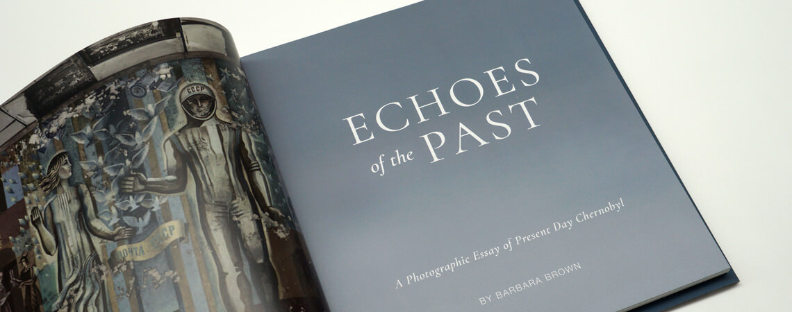
If you want to make your book to look like a professional coffee table publication, you can add a Colophon at the start or end of the book presenting the details about who designed it, where and when it was made, and who it was printed by.
Avoid goofy graphics
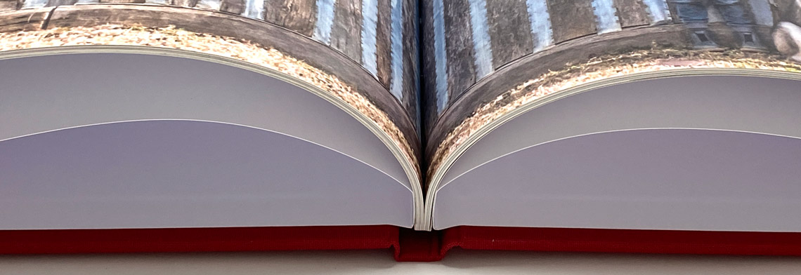
The point where the left and right pages of a book meet in the middle is called the ‘gutter’. Care should be taken when positioning photos over the gutter so you don’t lose important details where the pages are pinched into the binding.
To avoid one-eyed subjects or missing limbs, see our blog post on how to 'gutterproof' your design. You'll also find enlightenment on things to keep in mind when a photo spans a curved gutter versus a Lay-flat gutter, and why it's best to avoid diagonal lines crossing the page when printing on Lay-flat paper.
Cover & Finishes
As we said at the beginning, design doesn’t stop at the page design. Orientation, size, paper and cover materials are all design elements that can enhance the purpose or presentation of your book.
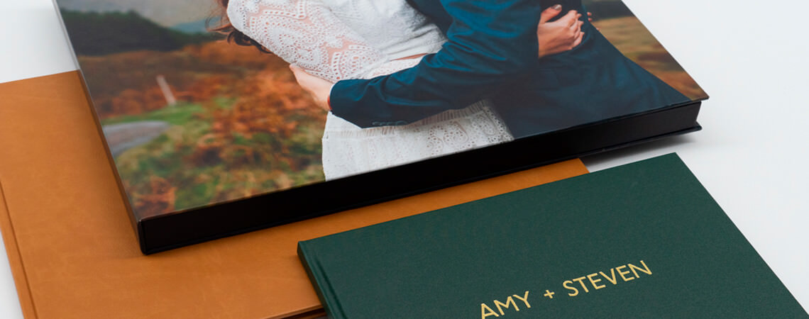
In the case of photo books, people do judge them by their cover so choose an iconic photo that reflects what the reader will find on the inside - in the same way that a first scene sets the tone for a film.
For a French holiday photo book you might choose the Eiffel Tower, while a wedding album really deserves the bride and groom to be front and centre, with a frosted fly page to give it a decorative flourish.
If you choose a material cover instead, use a colour that matches the design inside, or is meaningful to the story. Red linen with the title embossed in gold letters is a perfect combination for an Asian adventure, while black buckram with white text and black end pages would be an appropriate introduction to a collection of monochrome images.
A dust-jacket is an optional addition that looks professional and will help protect the book so it can be viewed for years and decades to come. They're easy to design in Momento's software, and we suggest you take advantage of the front and back flaps by adding a statement of purpose or biography.
Conclusion
We hope you can see that there is no right or wrong way to design a photo book but if you want to create a book that looks great and feels meaningful, aim for consistency across your page designs, a connection between the cover and the inside pages, and ensure they match the purpose of your book.
Most importantly, the design should never take away from the photography in your book, and it should inspire the viewer to keep turning the pages.
If you don't feel confident about designing your book, don't worry, the Momento software can do all the work for you. The philosophy and rules outlined above have guided the way we've built the Momento software, so if you need help getting started, choose Auto-Fill or Quickbooks when starting your next project, or choose from hundreds of Templates and decorative embellishments while in Layout View.
So now, go forth, enjoy the design process, and don't forget that less is always more!
Now to put this knowledge into action! Learn how to use all the design tools in Layout View in our How To Guide.
Photo Credits: Lauren Bath, Heartstory, Geoff Hunt, Drew Hopper, Barbara Brown, Amy Neale